Media Kit
OVERTIME Logo
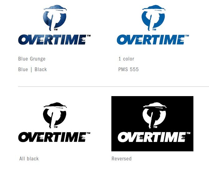
The OVERTIME logo and service mark should be used as our primary brand identity element in all marketing materials, social media and publications and must always follow these guidelines. The size and position relationships of all graphic elements are fixed and must not be altered in any way. The blue grunge logo is
preferred but other options may be used when background or material being used dictates it. Once the Trademark symbol is used on the first mention of OVERTIME in the content, it can be removed for all subsequent mentions.

OVERTIME Font
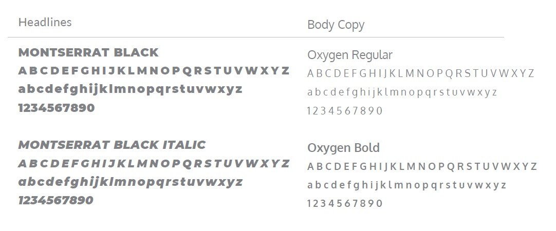
The following family of typefaces should be used for all corporate communications,
marketing materials and publications. To maintain the integrity of the OVERTIME identity, it is important to always use the specified font families.

OVERTIME Brand Colors
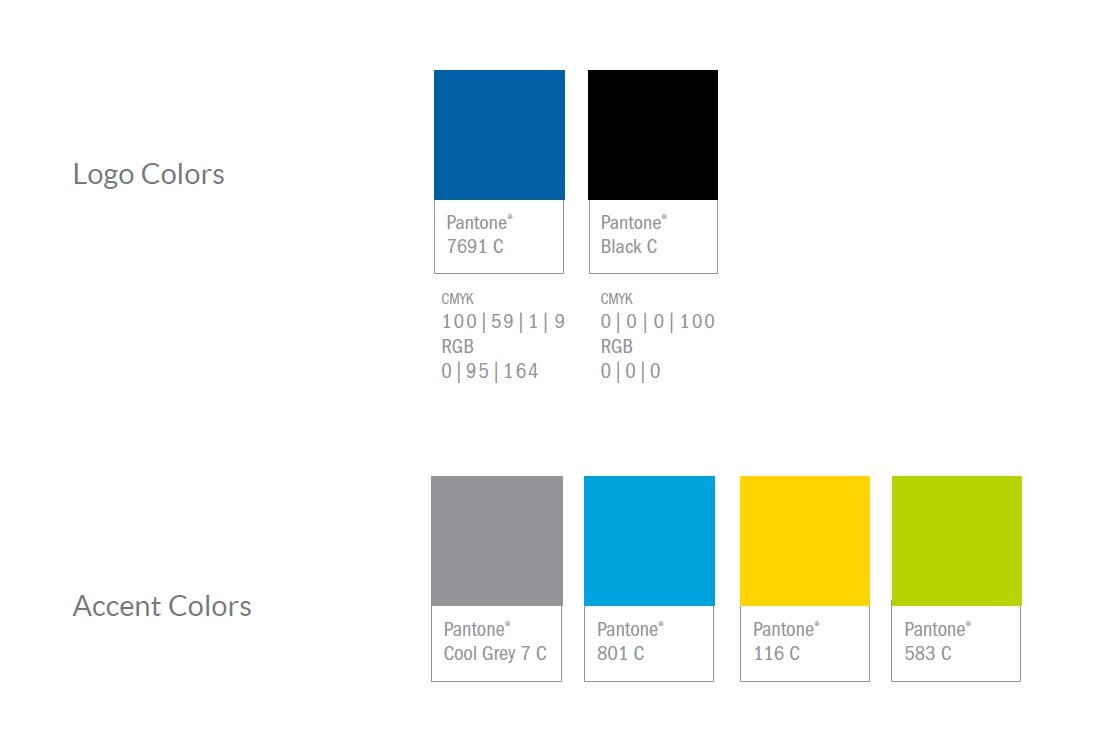
The OVERTIME colors as specified here are to be used in all applications including signage, printed materials, website and wherever else the identity is called for. Always use the PANTONE® Matching system to ensure the correct colors are used.

Unacceptable Usage
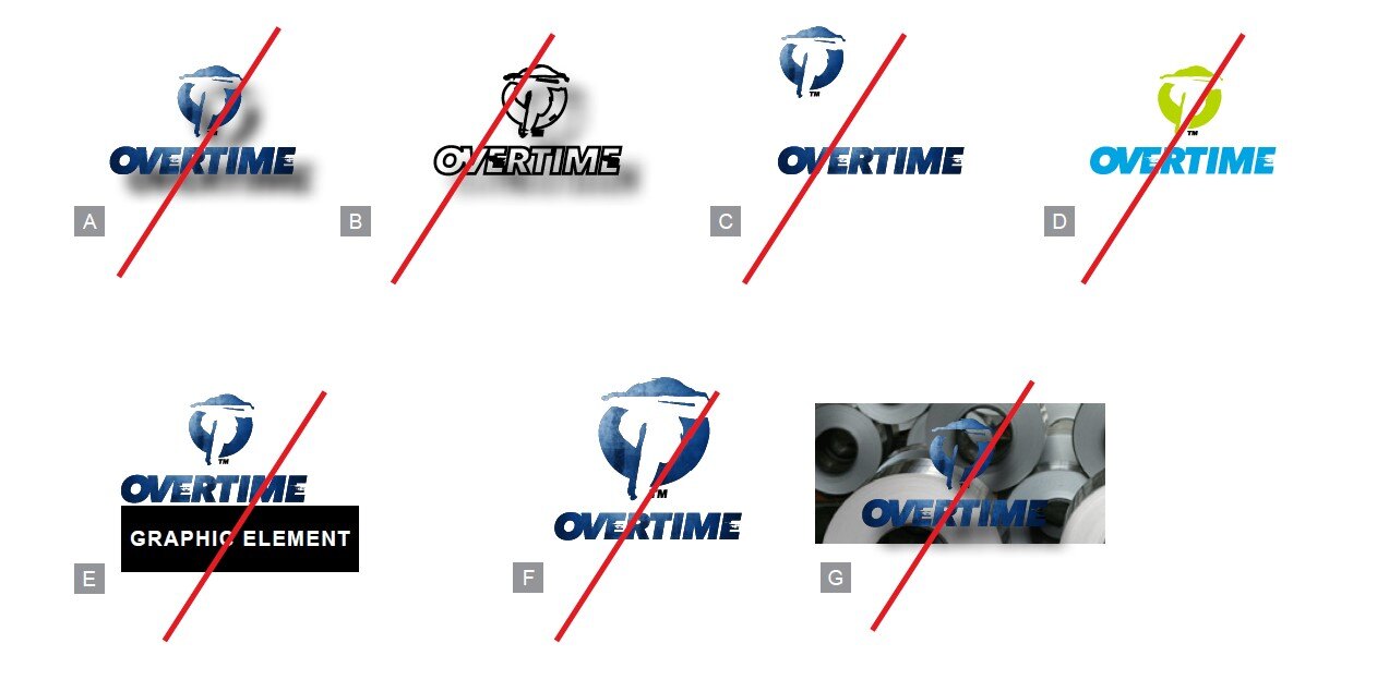
It is important to keep all graphic elements consistent throughout your communications, therefore you must not deviate from the logos.
- Never use a drop shadow on the logo
- Never outline the logo
- Never reposition any part, or parts of the logo
- Use only approved colors for the logo
- Always maintain the logo’s clear space
- Never modify the logo artwork in any way
- Never place the logo on a photo or illustration where readability will be compromised

